How to create and edit a data entry Form
When a Programme Lead accesses a project, any Forms, Editors and Statistics tools already created will be listed, along with options to edit, delete and add new instances of them.
To create a Form:
- Click
 in the Forms section.
The Form creator displays:

More details:
- To include a Search section in the Form (allowing users to search for a record and update it), see How to add a Search box in a Form.
- To customize the layout of a Form, see How to customize the layout of a Form.
- In the Title field, give the Form a descriptive name (which will be selected by users who have access to the Form).
- In the Description field, add a description of Form or details about how to use it.
 Details
When users access the Form, an Information icon will display alongside the title:

Clicking the icon will display a pop-up with the description:

- In the Identifier field, add a descriptive identifier (or leave blank and an alphanumeric identifier will be assigned automatically).
- To substitute an otherwise meaningless alphanumeric value in the URL with a user-friendly descriptor.
- If using a processing script as the script is named using the identifier. See Perform some special processing for more details.
- In the Table field, specify which EMu module will be updated when the Form is saved (a record will be created or updated in this module).
- The Deferrable option is intended for wireless devices and affects the order in which records are processed in the event that wireless connectivity is lost.Details
Options include:
NoThis is the default setting and in most cases can be left as such.
YesWhen Yes is selected and wireless connectivity is lost, a queue is created for any new records. Records are added to the end of the queue to ensure that when a connection is re-established the records are saved in the order in which they were created.
See The Deferrable system for details.
- In the Permissions section, specify permissions for Everyone, or for one or more users or groups.
- Click
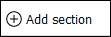 to add a section to the Form.
 - Add a descriptive name for the section in the Label field:

- Click
 to add a field to the section:
For each field we specify:
IdentifierUsed by the system to identify the field.
To keep things simple, it is recommended that the Identifier is the same as Label but lower case and without spaces. For instance, if Label is
First Name, Identifier could befirstname.An identifier is required, and it must be unique in this Form.
Note: Click a field or use
TABto move between fields.ColumnThe back-end name of the field that will be updated when the Form is saved. As the back-end field name is keyed into the Column field, a drop-list of available column names will display. Select a column name from the drop-list.
Note: Unless a processing script allows for it, a column should only appear once on a Form.
Fields are restricted to those available in the module specified in the Table field above.
Depending on the type of field specified in Column, various values will be auto-completed. For instance, if you specify an attachment field in Column, Type will automatically be set to
attachmentand Ref. Table, Ref. Column and Match Limit will be completed.LabelA descriptive label for the field as it will display to the left of the field, e.g.
First Name.Note: When adding an image control to a Form, it may be better not to include a Field label in order to maximize the size of the image control. This is particularly important when using a custom layout with columns.
KindOptions are:
imageUse to display an image in the Form.
capture
Enable users to locate multimedia of any kind that is accessible to their device and upload it.
Note: capture does not allow users to take a photo with their device and upload it.
image-captureEnable users to locate an image accessible to their computer / device and upload it.
Note:
image-capturemay enable users to take a photo with their device and upload it, depending on their mobile device.mobile-image-capture
Enable a user with a mobile device to capture an image with the device's camera and upload it.
Note: For details of these four image options, see Multimedia fields.
single
The selected value by default.
multiple
A table of values, e.g. Other Names: (Person Details) in the Parties module. When a table of values is specified in Column, Kind is automatically set to
multiple.See Kind: multiple for details.
TypeOptions are:
attachmentAllow a user to create an attachment. See Attachment field for details.
dateThe date picker pop-up will display when the cursor is placed in the field.
See Type: date for details.
integerFor integers only.
numberFor floating point numbers.
selectionWhere Column has an associated Lookup List, specifying a Type of
selectionwill present users with a drop-list of read-only values drawn from Column. In this case it is not necessary to specify the name of the Lookup List on Lookup.If a Lookup List is specified in Lookup, users will be presented with values drawn from the specified Lookup List (it can be any Lookup List).
See Type: selection for details.
textWhere Column has an associated Lookup List, specifying a Type of text will present users with a filtered drop-list of read-only values drawn from Column. Filtering occurs as the user enters characters in the field.
If a Lookup List is specified in Lookup, users will be presented with values drawn from the specified Lookup List (it can be any Lookup List).
See Type: text for details.
LinesUsed where:
- Kind =
single-AND-
- Type =
text
Specify the height (number of lines) of the text field.
AccessDetermines whether the field can be edited or not. Options are:
editable- the default access.hidden- the field is not shown on the screen.read-only- the field is visible but not editable.
The
hiddenoption is useful when used in conjunction with a default value (see Default below): it is possible to specify a default value for the field and hide the field from the Form's user, preventing the value from being modified and ensuring it is always added to the record created.RequirementOptions are:
optional- the default option; users may enter data in the field or leave it blank.mandatory- the field must be completed in order for the Form to be saved.suggested- the field should be completed but it will be possible to save the record if not.
An icon is added to fields that are specified as
mandatory( ) and
) and suggested( ). If a Form is saved with one or more incomplete
 mandatoryfields, the save will be prevented until the fields are completed.If a Form is saved with one or more incomplete
suggestedfields, the user will be alerted but will be able to save the record anyway.LookupWhen a field is specified as having a Type of
selectionorTextand Column has an associated Lookup List, a user is presented with a list of read-only values drawn from the Column specified.The Lookup option is used:
In conjunction with
selectionortextand Column. Specify the back-end name of a Lookup List to present its values to a user instead of the values drawn from Column.This could be useful, for instance, if Column includes a large number of entries and only a small number are required for the purposes of data entry.
Where no Column has been specified when using a Processing Script to perform some special processing.
Specify the back-end name of a Lookup List to present its values to a user. If the Lookup List is a multi-level hierarchy, use the Level field (see below) to specify which level of the hierarchy to display.
See Lookup for details.
LevelIf the Lookup List specified in Lookup is a multi-level hierarchy, use the Level field to specify which level of the hierarchy to display.
See Lookup for details.
DefaultA value to be added to the field by default when a new record is commenced in the Form.
Useful in conjunction with the
hiddenoption (see Access above). It is possible to specify a default value for the field and hide the field from the data entry user, preventing the value from being modified and ensuring that it is always added to the record created.Specifying an attachment field in ColumnWhen an attachment field is specified in Column, a user is presented with a text box; when a value is entered in the text box, a search is performed in Ref. Column in the target module (Ref. Table) and matching results are listed (up to the number specified in Match Limit) from which the user can select a record. On saving the Form, an attachment is made from Column to the record selected in the target module (the IRN of the attachment record is saved in Column).
When an attachment column is specified in Column:
- The table to which it attaches is automatically specified in Ref. Table, and Ref. Column is set to SummaryData; a default number (20) is added to Match Limit.
- It is possible to specify a Filter to restrict which records are returned by the search of the target module.
See Attachment field for details.
Ref. TableThe back-end name of the table to which the attachment field specified in Column attaches. It is auto-completed when an attachment field is specified in Column.
Ref. ColumnBy default, Ref. Column is set to SummaryData. This is the column searched when a user enters a value in the Search field of the Form.
The column searched can be changed to any column in Ref. Table.
Match LimitThe maximum number of results to display to the user. A default number (20) is specified, but this can be changed as required.
Add filter termWhere Type is
attachmentit is possible to specify a Filter that restricts which records are returned by a search of Ref. Table.Click Add filter term
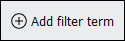 to specify a Column and Value to restrict which records can be attached to.
See Attachment field for details.
- Kind =
- Click to add another field to the section and configure as required.
- Add as many fields to the Form as required.
- Click
 to save the Form.
 - When you're finished with the Form, save any changes and click:
 Understanding icons in input fields
|
|
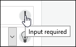
The field is mandatory. Place the cursor over the icon for a definition of the icon:
Or click the icon to display a message about what is required of the field. |
|
|
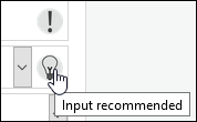
Completing the field is recommended. Place the cursor over the icon for a definition of the icon:
Or click the icon to display a message about what is required of the field. |

 Details
For the most part it is irrelevant whether the identifier is an alphanumeric value provided by the system or a descriptive label provided by the Programme Lead as it is only referenced behind the scenes by various components of Sapphire, or used to construct the URL for the Form.
There are situations when it might be handy to assign a descriptive identifier however, e.g.:
Note: If providing an identifier, it is recommended that it is constructed from letters, numbers, hyphens and underscores only (no spaces).
Details
A filtered drop-list of module names will display as you enter characters in the Table field. Select a module name from the list:

Note: When presented with a drop-list of values, it is best practice to select an entry from the list rather than keying the value into the field.
See How to specify permissions for details.

A Form can have multiple sections (or just one) with logical groupings of fields.


 and
and 


If it makes sense to organize fields into logical groupings rather than adding them all to a single section, click to add another section to the Form.
For instance, in this example we could add a section called Address to group address details separately from the Party's name:

Note: Note that an ID has been assigned automatically for this second section. We learn how to reference Section IDs when we look at designing a Custom Layout for a Form.
In this screenshot the first section has been collapsed to conserve screen space: the number of fields in the collapsed section is indicated beside the section label (Name in this example).
Note: It is possible to drag and drop a field within a section (to change its position on the Form) and between sections. It is also possible to drag and drop sections in order to rearrange their order on the Form. While not necessary, it can be handy to collapse sections before dragging them.
If you did not specify an Identifier for the Form, it will be assigned automatically.
The Form undergoes validation. It will not be possible to save the Form until all mandatory fields have been completed.
|
|
Return to the Home screen. If you belong to more than one project, the Home screen lists all the projects you belong to. If you belong to one project only, the Home screen lists the elements of the project that you have access to. |
|
|
Return to the list of elements you have access to in the current project. Note: If you belong to one project only, the Home and Project buttons return you to the same location. |


-OR-
Click  to exit the application.

